
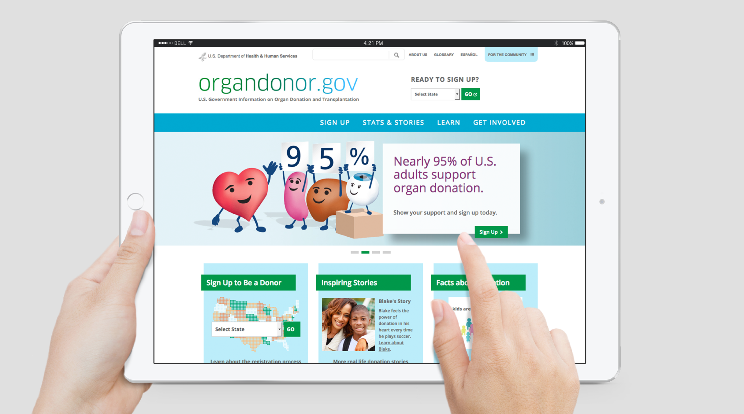
 Home page
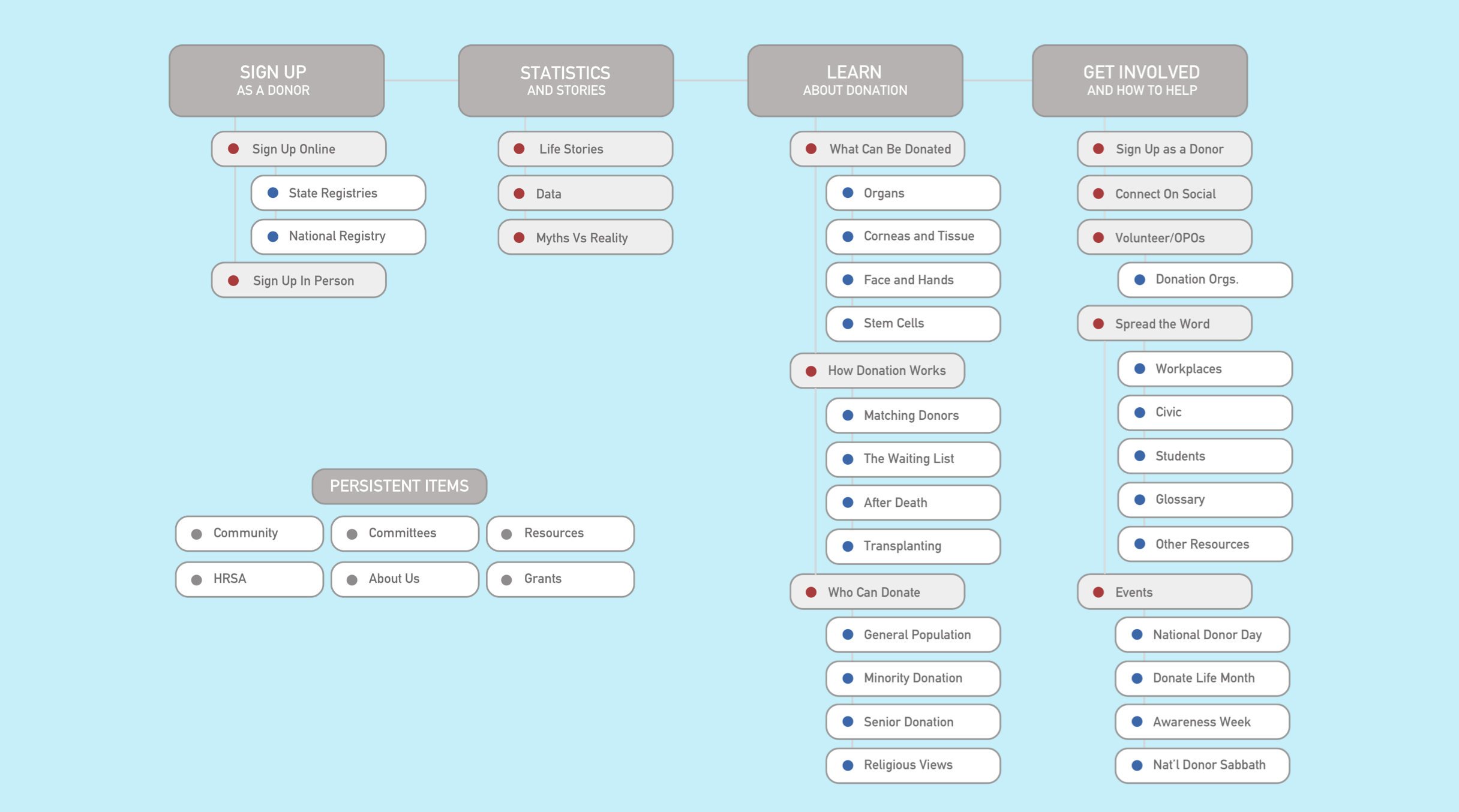 Site map
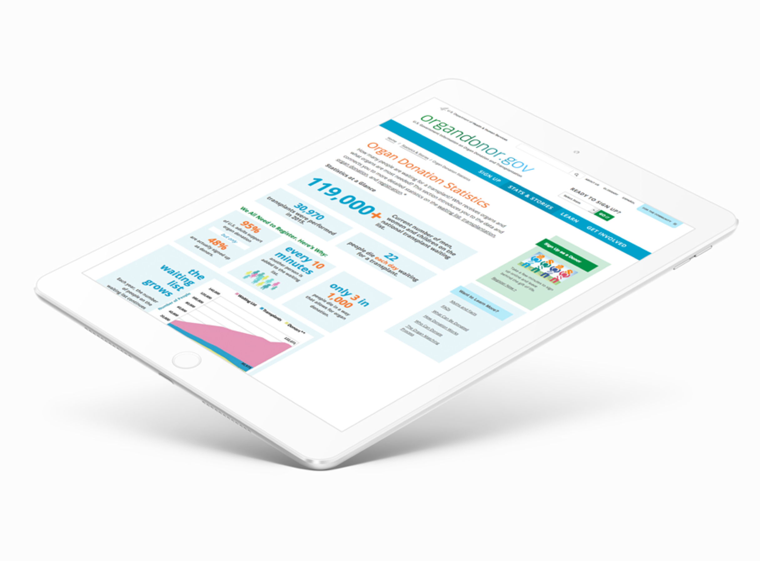 Statistics page was
designed dynamically for easy updates and high search value
Statistics page was
designed dynamically for easy updates and high search value

The new site uses storytelling interwoven with facts and editorial content for maximum impact

Every page has tailored onward journeys for key conversions like "become a donor" or get involved as a volunteer or an advocate

It's easy for any user to become a donor from any point on the site, despite different state registries and state-specific donation laws
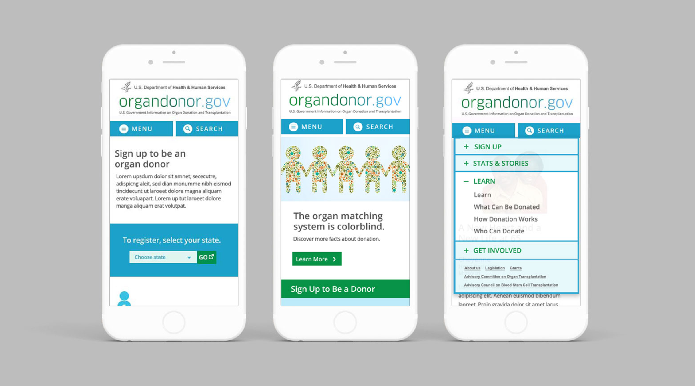 Fully responsive
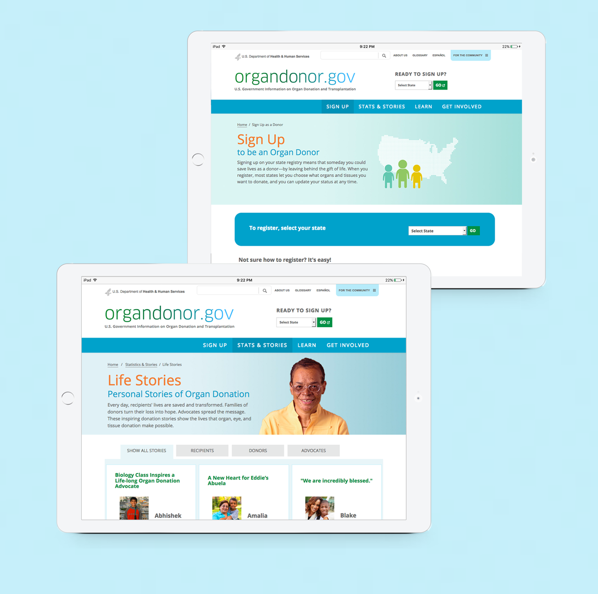 Donor registration landing page, and content including donor, recipient and advocate stories
US Department of Health and Human Services
Organdonor.gov
Organdonor.gov is the US Department of Health and Human Services's organ donation website. This project was to restructure and redesign the ten-year old site, consolidating and remapping organically-grown content and structure, creating a fully responsive and accessible experience, and bringing focus to key actions and content.
Outcomes
- Delivered redesign contributing to 4 million annual registrations: Restructured and redesigned 10-year-old site, consolidating organically-grown content into fully responsive and accessible experience. Following year saw 4,000 new registrations daily, with site achieving key awareness and engagement goals.
- Applied UX methods before formal UX training: Used competitive analysis, wireframing, interaction design, and stakeholder interviews intuitively. Collaborated with senior writer during wireframe stage to strategically consolidate sections and text, resulting in highly effective partnership despite complexity.
- Created maintainable technical framework: Built carousel system allowing traditional illustrators to compose and update multi-layered images without coding knowledge. Developed front-end prototype (homepage, carousel, social modules, template pages) to clarify handoff between dual stakeholders: HHS end client and their IT division.
Live Links
Organdonor.gov (Archived)
Expand Details ►
Objective
Consolidate content, increase awareness and donor registration
Goals
Awareness, Engagement
Research Methodologies
- Competitive Analysis (non-profits and other related government sites)
- Stakeholder Interviews
Comparable Products
Donate Life America, National Kidney Foundation, American Heart Association
Deliverables
Responsive Wireframes, High-Fidelity Designs to 3 breakpoints, Content Templates, Site Style Guide, Accessibility Requirements/Tags, Front-End Prototype, Type Treatment, Iconography, Illustrations
Team
Experience Director, Strategist, UX/UI/Visual Designer (myself), Copywriter, Junior Designer, Front-End Developer, Illustrator
Challenges
We were working with both the end client at The US Department of Health and Human Services, and their IT division. We had to align our design to what the end client wanted and their developers were willing to develop. In addition to high-fidelity designs and a style guide, we clarified the handoff by building a front-end prototype of the homepage, carousel, social modules, as well as some template pages so the structure was clear.
Other Results
While the site redesign can't take credit every registration, the year after it was released there were 4 million registrations, with 4,000 new registrations each day.
I'd designed this site before I knew what UX was. Unbeknownst to me, I used UX methods like competitive analysis, wireframing, interaction design and stakeholder interviews. I'd also created a carousel framework, so a traditional illustrator could easily compose and update multi-layered images without any coding or framework knowledge.
I'd also collaborated with a senior writer in the wireframe stage, so we could smartly consolidate the sections and text. I'd say it was one of my most challenging, but effective collaborations.
Next Steps
- Taxonomy Study
- Analytics Analysis
- User Testing